Brick or Stone: Reading Two Kinds of Facade
Brick or stone facades create different visual rhythms. Learn to read their joints, unit shapes and surface patterns on a familiar street.
The common mistake when comparing a brick or stone facade is to name the material and stop looking. That misses the pattern doing much of the visual work: joints, unit shapes and shifts in texture can make a wall feel brisk, layered or quietly monumental. Read those details together and an ordinary street becomes easier to understand.
Begin with the rhythm, not the material label
Brick often presents a steady beat. Its units tend to be similar in size, and their horizontal courses make long lines across a wall. The joints repeat at regular intervals, so the eye can follow the pattern without having to search for its next cue.
Stone can make a different impression, though the word covers many arrangements. Regularly cut blocks may form orderly courses, while roughly squared pieces can create a more varied pattern. Large blocks set beside smaller ones interrupt the beat; a carefully repeated stone unit can be as measured as brick.
So the useful question is not simply “brick or stone?” Look at how the units relate. Are they close in size? Do the joints line up, alternate or wander? Does the pattern continue around corners and above openings? Those observations reveal the facade’s visual rhythm more reliably than a quick glance at colour.
Follow the joints across the wall
In brickwork, the mortar joints are part of the pattern, not empty gaps between the units. Long horizontal bed joints can pull the eye along a facade. Short vertical joints, called perpends, break those lines into a running sequence. In common running bond, each brick overlaps the joints in the course below, creating a regular stagger.
Other brick bonds change the beat. A pattern that alternates brick ends and long faces can make the wall look more interlocked and busy. A narrow strip of bricks set upright may mark a boundary or frame an opening. Even where the bricks share a colour, these changes give the surface a visual punctuation.
Stone joints deserve the same attention. Broad, even joints can emphasise a block’s outline, while fine joints allow the stone faces to read as a more continuous plane. Irregular joints draw attention to the edges and variation of individual pieces. Stand back enough to see the whole wall, then move closer to check whether that pattern comes from the stone shapes, the mortar, or both.
Notice what unit size does to the facade
Repeated small units tend to make a wall feel finely grained. Brick’s compact pattern can connect a long facade into one legible surface, even when windows and doors interrupt it. The repeated scale gives the eye plenty of small steps to follow.
Larger stone blocks offer fewer, broader divisions. Their joints may frame substantial planes, giving the wall a slower visual cadence. If block sizes vary, the pattern can feel more animated, with the eye moving from one large face to the next. Neither effect is automatic: block dimensions, joint widths and the arrangement of openings all matter.
Colour complicates the reading. A strong contrast between brick and mortar makes the grid stand out; a close match softens it. A stone with visible changes in tone may make each block distinct, while a more even surface lets the overall courses take precedence. Compare the pattern in both bright and shaded parts of the facade, because grazing light can make edges and texture more apparent.
Read corners and openings as pattern changes
A facade is not a flat sample board. At a corner, check whether the units turn neatly, alternate across the junction or meet with a visible edge. Brick corners may preserve the running rhythm or introduce a band of upright bricks. Stone corners may use larger or differently shaped pieces, making the turn feel especially pronounced.
Windows and doors also interrupt the unit pattern. Brick arches, projecting courses or a change in bond can draw attention to an opening. Stone lintels and surrounds may appear as distinct frames, or blend with the wall if their colour and jointing are similar. Look at the shape above the opening as well as its sides: the wall’s courses may continue, step or stop there.
These details help explain why two facades made from the same material can feel unlike one another. One may keep a steady field around its windows; another may use contrasting surrounds that break the surface into separate visual zones.
Say you compare two neighbouring shopfronts
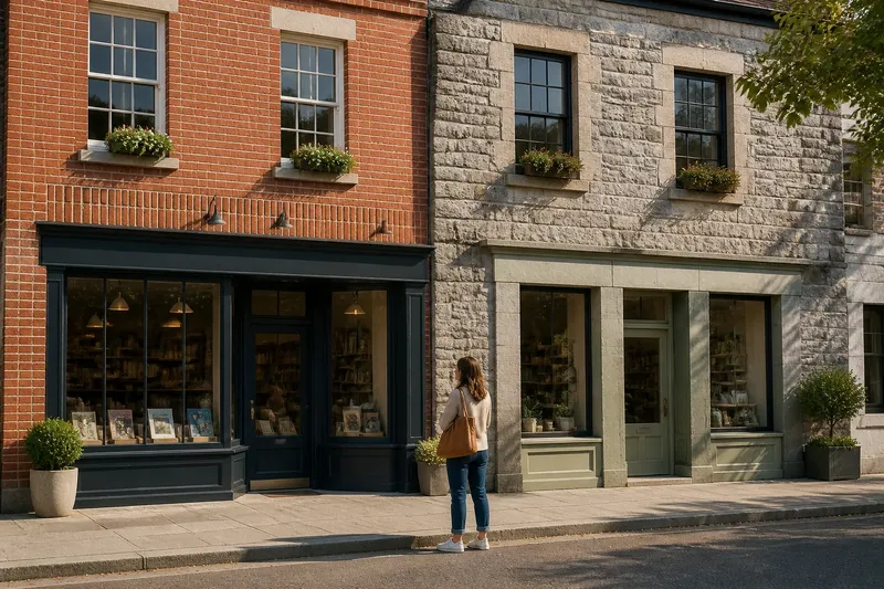
Say you are standing on a fictional high street with two invented shopfronts. One has red brick in evenly staggered courses, pale mortar and a narrow upright-brick band above the windows. The other has grey stone blocks in varied lengths, with joints that shift from course to course and plain stone surrounds at the openings.
Start by looking from across the pavement. The brick shopfront reads as a fine, continuous grid; the stone one gives the eye fewer, broader stops. Move closer, and the pale mortar makes the brick pattern especially clear, while the stone’s changing block lengths create a less regular sequence. Look above the windows: the upright band punctuates the brick wall, while the matching stone surrounds keep the second facade more unified.
The result is not a verdict on which material is better. It is a clearer account of what each facade is doing. The brickwork establishes a repeated beat and then marks the openings; the stonework varies its beat while keeping the frames visually close to the wall. That reading comes from observable choices, not from assumptions about age, cost or quality.
Questions that sharpen a facade reading?
How can I tell brick from stone on a street?
Look for repeated unit shapes and the pattern of joints, rather than relying on colour alone. Brick often has consistent rectangular units, while stone may show broader faces or more variation in shape, but both materials can be cut and arranged in regular patterns.
Why do some brick facades look more orderly?
Regular courses and repeated bond patterns give the eye a dependable sequence. Mortar that contrasts with the bricks can make that sequence stand out, while a closer colour match can quiet it.
Can stone look as regular as brick?
Yes. Stone blocks can be cut to similar dimensions and arranged in level courses, producing a measured grid. The material name alone does not tell you whether a facade will feel regular or varied.
What should I look at around a window?
Notice whether the courses continue past it, change direction or stop at a surround. A contrasting lintel, arch or band can make the opening a strong visual marker; a closely matched surround may keep it within the wall’s larger pattern.
Use the surface as a street-reading tool
For a useful brick or stone facade reading, take in the whole wall before studying a detail. Trace one course across the surface, compare the unit sizes, then see how corners and openings alter the pattern. A good everyday analogy is a tiled floor: the tiles matter, but spacing and layout decide whether your eye meets a calm grid or a lively arrangement.
Where the facade’s material is uncertain, describe what you can see without forcing a label: repeated rectangular units, broad blocks, narrow joints, varied courses. The point of reading brick or stone is not to identify every building perfectly. It is to notice how material, unit and joint combine to give a familiar street its particular rhythm.